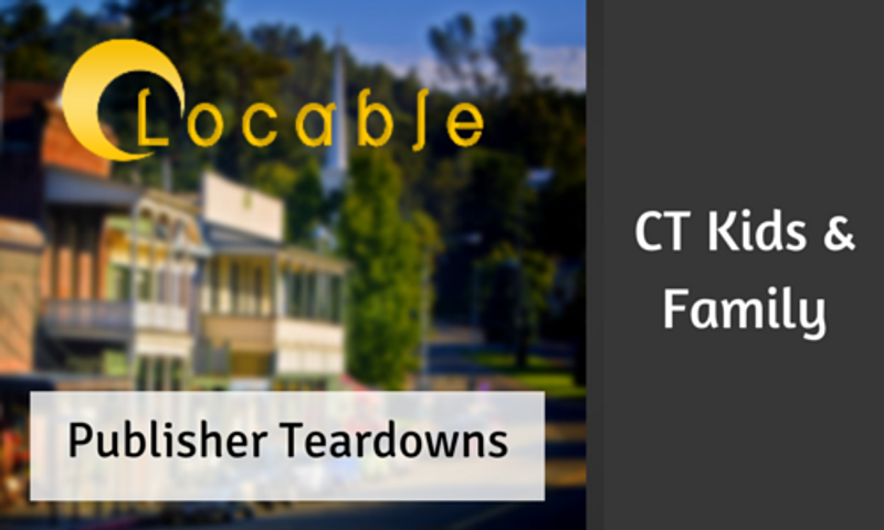
Publisher Teardown: Connecticut Kids and Family online
In Locable’s Publisher Teardown Series we're breaking down a website and providing some analysis so you can learn different components of what makes a successful local publisher site. We take into account factors such as design, content, and social sharing to help highlight some of the things publishers should be mindful of on their site.
Today, we have a local publisher teardown of the website for Connecticut Kids and Family magazine. We want to emphasize that our publisher teardowns are meant to be educational and informational to help you make sure you’re thinking about important parts of a successful web strategy and avoid some of the common pitfalls.
We are going to take a look at a few different factors that help create a great web experience for your readers and keep them coming back for more.
Design
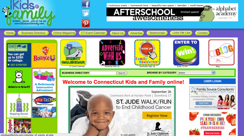

Navigation is also an issue on this site. They have two different forms of navigation with the colorful graphics on the home page below the more traditional navigation bar. If a reader gets to the site and was looking for event info and the blog navigation is in two different places. It’s easily confusing readers can get lost or frustrated quickly.
We would also recommend trying to steer away from graphics that aren’t clearly labeled. It is a good idea to have an event calendar and newsletter button, but just make sure they are clearly labeled. As a graphic only, if the reader isn’t looking for them, they are easily missed.
Content Placement
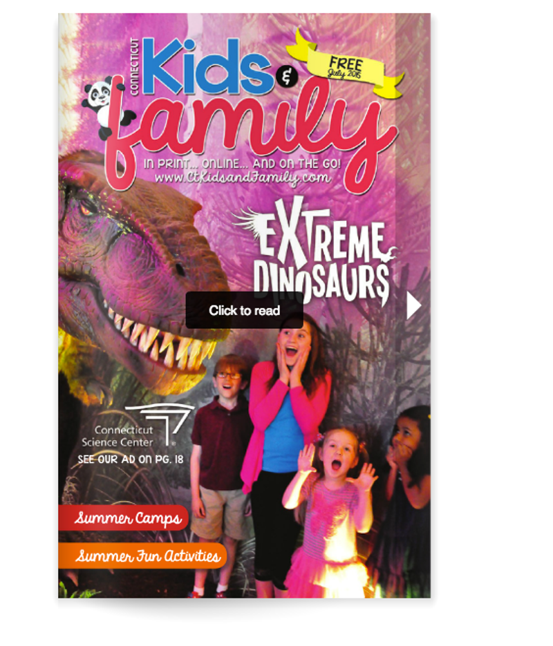
Probably the biggest problem with this site is the content organization. From the homepage, it’s pretty difficult to locate where actual content is located. You can navigate to the online magazine but this takes you to an online flipbook. It loads slowly and even worse, normal font is almost unreadable once it’s open. If you try to read more than a few pages, it will most likely crash your browser. Most readers likely won’t bother with it at all, meaning they won’t be seeing any of the print content from the publication online.
The blog is better for content and you can actually read along, but it feels like an afterthought on the site, and it can only be reached from the troublesome graphics we talked about on the homepage. There is a message from the publisher on the homepage but it is hidden under graphics, advertising, and sponsored events. They do have some great guides that would be valuable to readers, but they are hard to find buried toward the bottom of the site.
Events and Directory
The events directory is one of the best parts of this site. Although the design looks dated, there are many events in the calendar and it is easily searchable by location and date. This calendar would be outstanding if the design was updated.
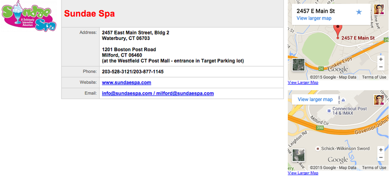
The business directory is a different story. There is a pretty extensive list, however it is not easily searchable and it’s difficult to find a business if you are looking for a specific category. As a result the directory won’t be a destination for readers and they won’t be able to easily find information about local businesses. This is really a disservice to local businesses, especially those that advertise with your publication because readers won’t be able to find them. Once you do reach a specific business listing you are able to find the important information like address, phone number, website, etc. so that is a plus.
Use of Pictures
For a website focused on kids and family, there is a huge lack of pictures of kids and family on their site. It is very hard to find any coverage of the events they are listing. You don’t fee a sense of connection to places and events in the community because there is almost no visual reference. Text and graphics are important, but sometimes you need pictures of real people and places to connect with readers and that is sorely lacking on this site.
Advertising Placement
This site is also suffering from too much advertising. Local publications have a duty to showcase their advertisers, and getting them business should be a top priority. At the same time publisher’s need to respect their reader’s. Advertising should be present to get the attention of those interested, but it can’t be the main focus of your site. No one wants to visit a site that feels like a giant ad.
Social Sharing
There is almost no place on this site for reader’s to engage or share things they like. Because content is almost non-existent on the main site, it will be especially hard to share anything. However, even with the helpful and engaging content like events and contests, there is no easy way to share them. This will prevent how much the message will spread online and it takes away from reader engagement.
Final Thoughts
Overall, this publisher needs a lot of help. The online part of their tagline “In print…online…and on the go!” is severely lacking. It’s a shame because they have a huge Facebook audience that is obviously trying to receive their content. Their site is really preventing them from fully engaging with that audience. This could result in thousands of dollars or more in lost revenue because of less traffic and advertisers that simply won’t want to advertise online. With some simple design and navigation tweaks and a solid content strategy would go a long way toward creating a huge online asset and extension of their brand.